Components
Provus is designed to make creating beautiful and functional website pages easy for content editors without requiring coding skills.
All of the design components below are included with Provus. Content editors simply provide text and images in simple forms and the content is automatically formatted. Styles (fonts, colors, etc.) can be pre-configured for these design components, allowing content editors freedom to combine the components on pages to display content in various combinations while ensuring your website reflects your branding and style guides.
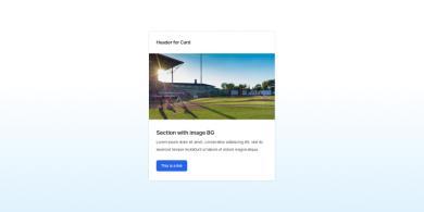
Card
Cards can be configured to display your content in a variety of ways. See the options by clicking the button below
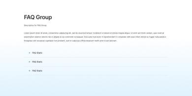
Accordion
Have a lot of content to display compactly? Accordions are the solution.
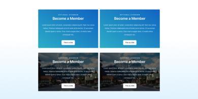
Call to Action
Move your site visitors to take the next step with a compelling Call to Action.

Testimonial
Share feedback from your constituents or clients easily anywhere on your site with the Testimonial component.
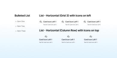
List
Lists are useful for simple content lists as well as lists of links.
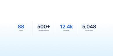
Stat Group
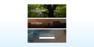
Banner
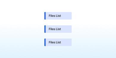
Files List
Files Lists provide an easy way to display documents related to content on a page.


